
After picking organic raspberries in Concord, Massachusetts one sweltering August Sunday, my husband Dan and I headed for refreshment to the Main Streets Market and Café in Concord Center.
Main Streets Market and Café bustles all day with customers popping in to take out coffee, tea, and pastries. It is also a restaurant with ample seating inside and outside, serving breakfast, lunch, and dinner.
All customers enter through a screen door in front of the café.
Two steps into the café, customers encounter an initial space before the take-out counter. A two-tier, stainless-steel rolling cart bisects the space. Two black mats on either side of the cart indicate space for customers to queue up.
Below is the scene as we entered the café.
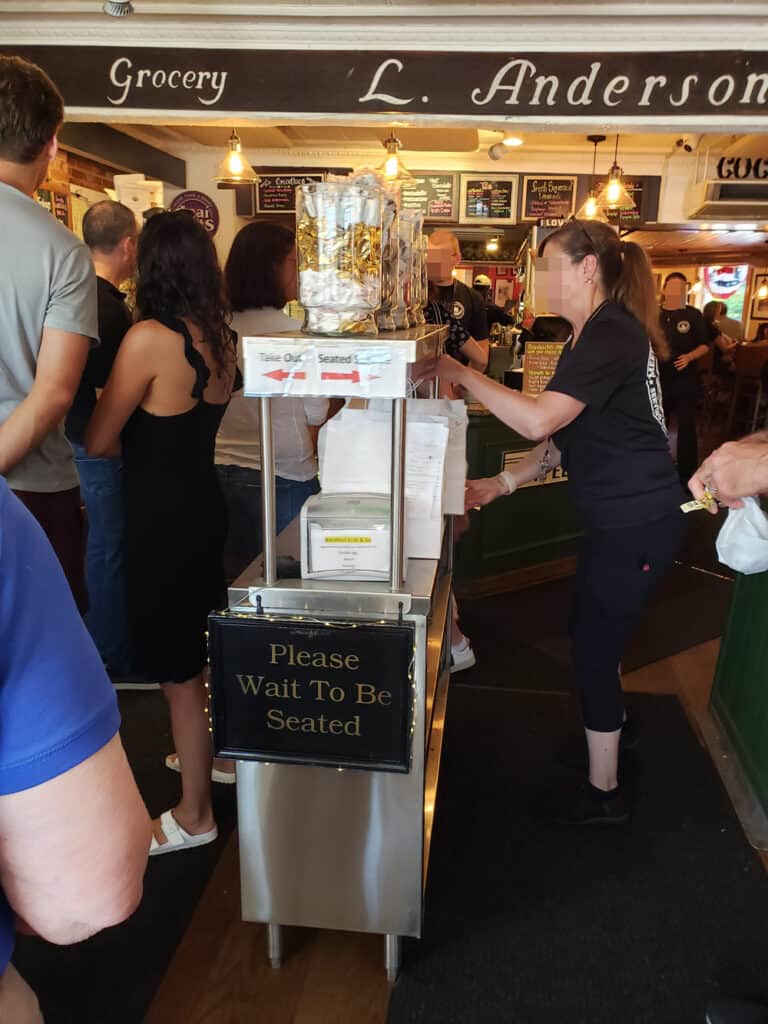
We walked up on the right, where the server in the picture is pulling the cart toward her.
After waiting 5 minutes, a server asked if we were having lunch. We said we were just looking for drinks and a snack. She replied the take-out line was on the other side.
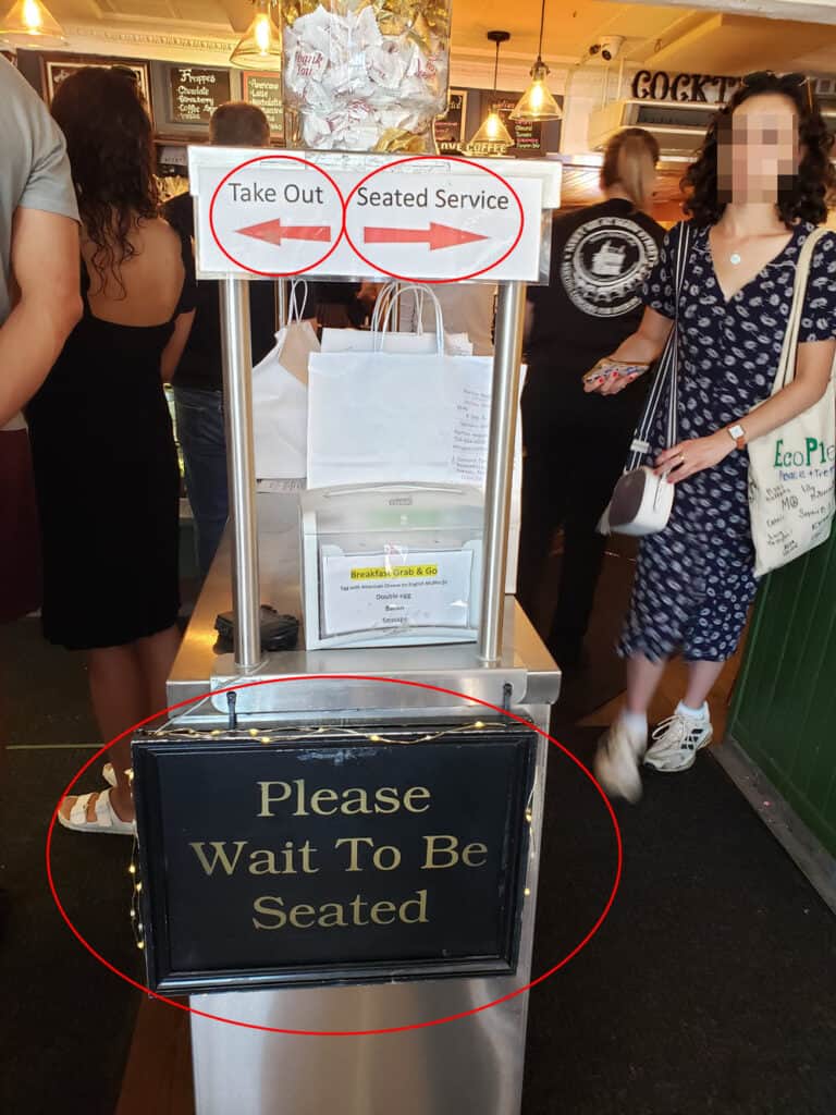
She pointed to 2 small signs taped to the cart and apologized for the confusion.
Neither Dan nor I saw those signs when we walked in.
We queued up on the left side of the cart for 10 minutes until we could order our iced tea, coffee, and a muffin to share.
The tables inside filled quickly. While Dan waited at the take-out counter for the drinks and muffin, I nabbed a table for two near the front.
Another server approached me and asked if we were having lunch. When I said no,
she said the inside tables were only for dining with the restaurant. The outside tables were available to anyone though.
She apologized for the confusion.
I told Dan we needed to go outside and stepped away from the crowded take-out area to wait for him.
While waiting, I saw servers apologizing and redirecting other customers who got in the wrong line or seated themselves in the wrong place.
I felt better about my line and table errors but wondered how much time the servers spent apologizing and directing traffic.
Signs Hiding in Plain Sight
Main Streets Market and Café has a small entry space. It’s often crowded because their food and beverages are consistently great.
When I took a closer look at the café’s entry, I noticed the 2 signs I had missed were small and at shoulder height, while the “please wait to be seated sign” was low, maybe hip height, and didn’t say where to wait.
Retail environment expert Paco Underhill explains in his book Why We Buy that customers need a “landing strip” once inside the store, a “decompression zone.”
Customers are likely to miss signs placed right at the entry, he said.
Guilty as charged.
Instead, Underhill advocated putting signs about 10 feet into the retail establishment. For many stores, this will work. Main Streets Market and Café doesn’t have that luxury.
But café management still has incentives to fix the situation.
No Customer Likes to Wait
Since we were in the wrong line at first, our wait time from café entry to service stretched an extra 5 minutes.
By the time we reached the take-out counter, it felt like we had spent an eternity in the café.
The café’s ineffective signs were elongating customers’ wait time.
In Why We Buy, Underhill said waiting time is the single most important factor to customer satisfaction.
Longer wait times mean lower customer satisfaction. Some customers will just leave.
Improving signage would not only shorten wait time, it would free servers from having to direct customers, boost customer satisfaction, and perhaps prevent impatient customers from bailing.
According to research by the Signage Foundation, over 60 percent of businesses reported a 10 percent increase in sales after adding or updating their signs.
Help Your Customers Find Their Way
Here are 3 ways your brand can reduce wait times and help your customers find their way.
1. If you have a brick-and-mortar-store, use signage to enable customers to find their way easily.
Supermarkets number their aisles and list the item categories in each one.
Department stores post directories listing each floor’s departments and where to find restrooms.
I’m not a professional designer, but I’m not afraid to play one in a newsletter.
What if Main Streets Market and Café ditched the ineffective signs and put brightly colored arrows on the floor or on the black runners? Arrows on the left side could say Take Out. The right ones might read Eat In.
If they repeated the arrows across the runners, they would catch attention, help anyone who missed the ones closer to the door, and indicate more clearly where the lines should form.
I bet those signs would improve customers’ chances of landing in the correct line, reducing wait times and letting servers focus more on seating and serving than directing.
2. If you have a professional service, use your proposals to create a clear vision of what the path of working with you looks like.
Detail your process. Describe what you’ll do at each stage, and what you’ll need your client to do.
Spec out the timing, with proposed dates if relevant.
Present the cost to the client, specifying what is included and what you will deliver.
Make it easy for your prospect to envision doing business with you.
A recent proposal I wrote for a rebrand and website refresh specified four phases and detailed exactly what would happen in each, what I would deliver, when it would happen, and how much it would cost.
That clear vision helped the prospect see the way to their desired goal, and turned them into a client.
3. If you have a website – and if you are in business you should have a website – ensure it is easy for customers to navigate, find what seek, and buy.
Put your most sought information and offerings in your website’s menu. Ensure visitors can access them with one click or as few as possible.
Design each website page to motivate your customer to act. Channeling them toward one action (request information, schedule a consult, subscribe, buy) per page works best.
Presenting too many choices complicates decisions and increases the chances the customer will pass on the decision.
Remember, we customers don’t want to think hard while shopping.
Use big bright buttons for the action you want them to take and describe the action clearly.
Prepopulate forms when possible or better yet, make them unnecessary.
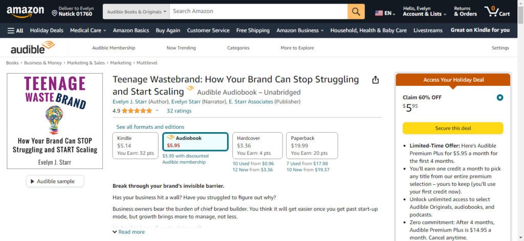
However you feel about Amazon, they provide an excellent example of product purchase pages.
The search bar, what most people need first, is centered at the top and highlighted in white against a black header background. Product categories are to the left. The words “Search Amazon” appear in gray, making it easy to see where to type your search.
Amazon knows people tend to look to the right. Product photos and information appear on the left. The bright yellow buy button appears on the right, demanding attention.
In the example below, Amazon highlights a holiday deal for me on the right in white writing on a rust-colored background, then uses the yellow button for me to “secure this deal.”
Super clear.
When I checkout, Amazon has my personal information and credit card on file, making it a single click to complete the purchase.
Speaking of checking out, check out the deal for yourself. 😉
Every Experience Affects Your Brand, Including Direction
Directing customers well is integral to all top-notch brand experiences.
Not doing so saddles your brand with unintended associations.
Months later, my image of Main Streets Market and Café comprises servers apologizing, a congested entryway, long lines, and confusion.
If I was in Concord and in a hurry, I might not bother.
Every experience you deliver colors your brand image. Take the time to direct your customers well. It will pay off!
How do you ensure your customers have an easy path to doing business with you?
More like this:
If You Promise Chocolate, You’d Better Deliver
The Free Dessert that Made Things Worse
…I guess food’s been on my mind. 😊
***
Just for Fun
Go on a road trip with the “Please don’t destroy” guys from SNL as they get lost. (3 minutes, 49 seconds)
See George Washington (Nate Bargatze) sketch out the future direction of the US for his soldiers in this SNL skit. (4 minutes, 50 seconds)
Enjoy!
If you liked this post, you’ll love the next one. Get future posts right to your inbox by clicking here.
Loved the column this week! I’ve been teaching a Visual Management class at a factory in the Hudson Valley, and the focus there is in the same self-service vein. I ask the participants how often they have to find their supervisor or internal supplier to ask for information. “Which job do you want me to work on next?” “Is job X going to be ready for me to pack today?” These are questions that should have been anticipated… they get asked dozens of times a day. So why delay the work when the a public board or other visual cues can share important information like priorities or scheduling?
Thanks Jay! It’s amazing how much having an FAQ mentality and planning around that can reduce frustration and improve productivity. Your inquiry examples show how focusing on employee work flow can elevate everyone’s brand experience, including the supervisors and internal suppliers! Appealing to them with that benefit sometimes helps them edge toward changing the way they work. It can’t be fun on the receiving end of repeated questions and frustration.